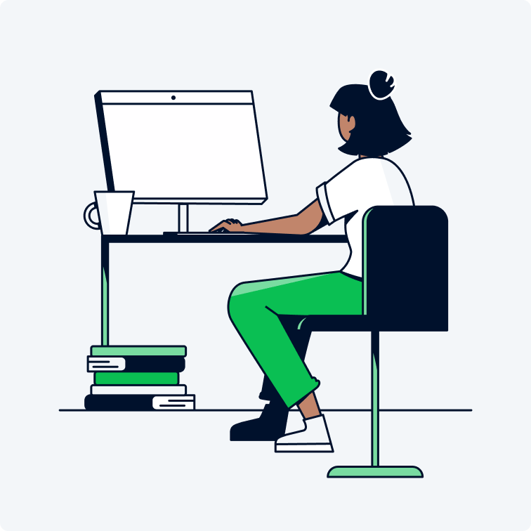
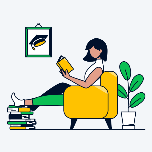
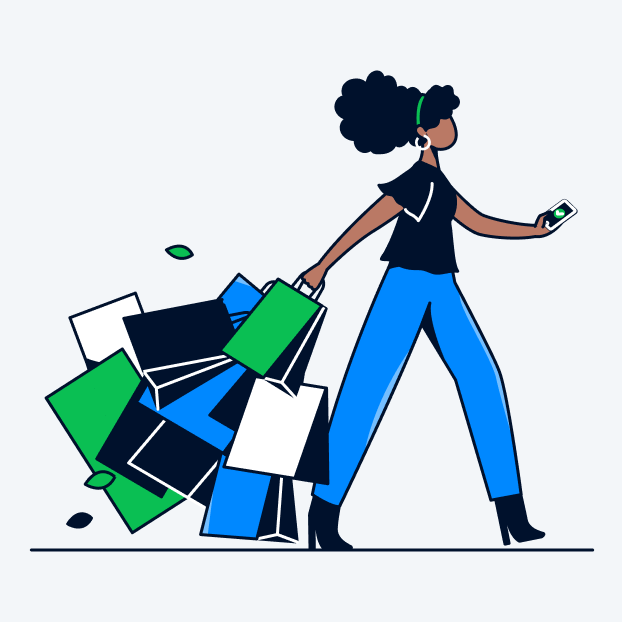
Illustrations are used to simplify complex ideas. Sometimes photography or video cannot be used to explain certain topics, this is when our illustrations come in handy. But we try not to overuse our illustrations, because they should only be used to draw attention to specific features without overpowering them with too much content.
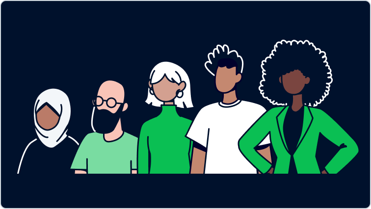
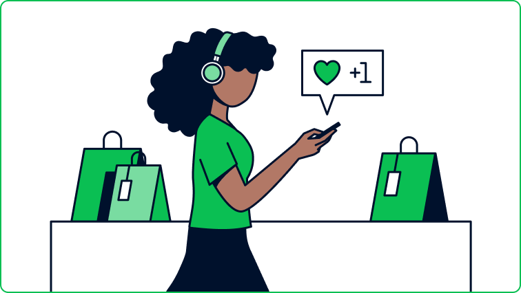
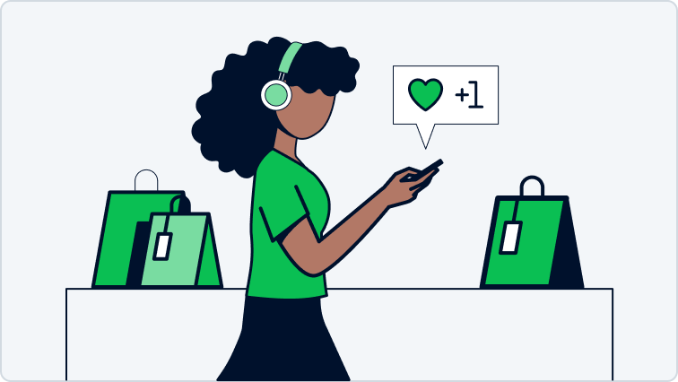
Although our illustrative style is very clean, and surroundings or products are built from simple lines, our characters are more warm and approachable which goes with our brand personality. They have diverse haircuts, clothing, skin tones, and other details to make them more inclusive and human.
Do's & Don'ts
Don’t use illustration for HR or recruitment purposes. For example, when recruiting people for a job opening. Another example: when posting on social media about the Adyen work culture.For these instances, you should always use photography.
 Use illustration to visualize complex ideas.
 Don’t use illustration for real situations/employer branding.
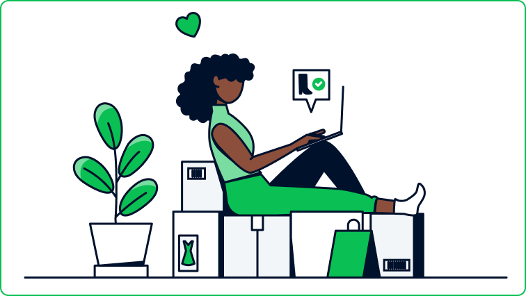
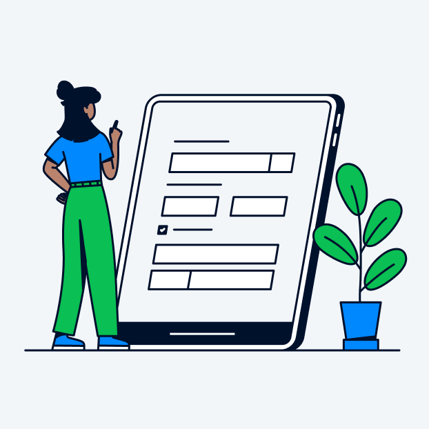
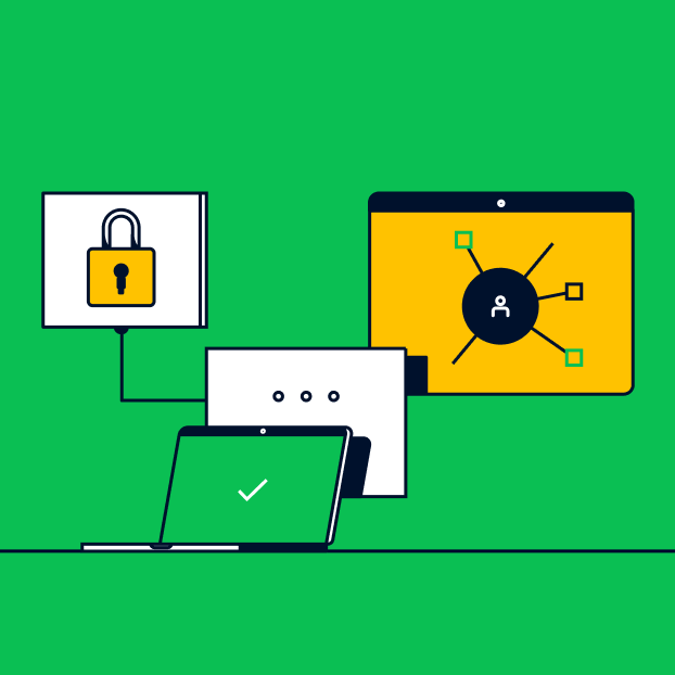
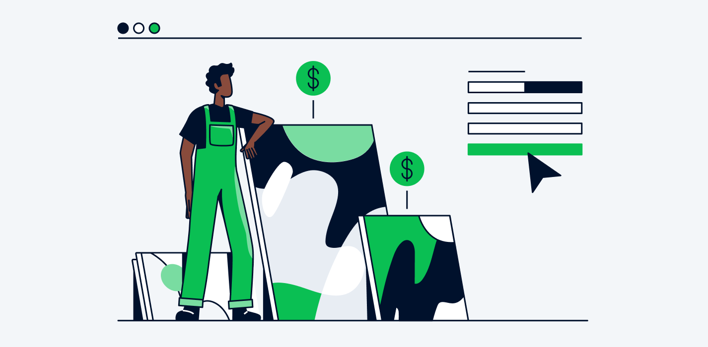
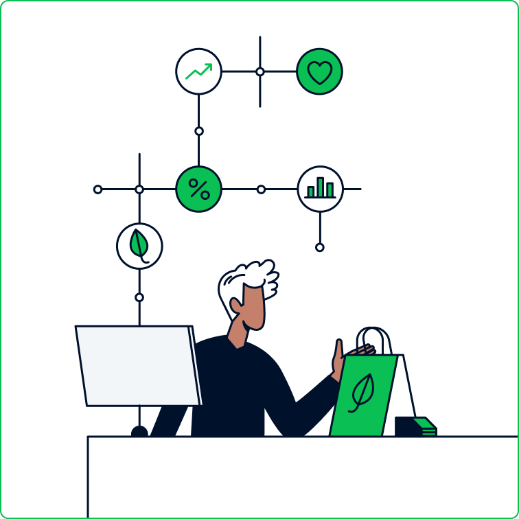 Use illustration to show an abstract idea, or technical aspect in a scene.
 Don’t show our products “solo” - use photography instead.
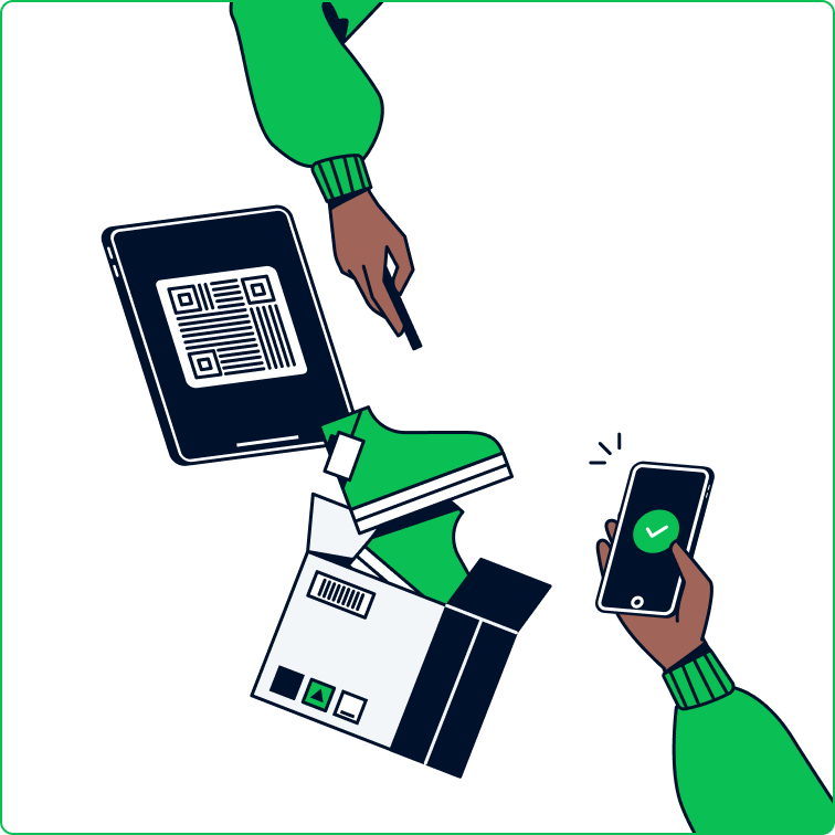 Use illustration to show a step-by-step process.
 Don’t work in perspectives: we use 1 horizon.
Colors
Main & support colors
Start with our primary brand colors: Adyen Green, Adyen Black and, if needed, Adyen White, and white. When illustrating people, there are multiple skin tones applied. There is no palette for the skin colors, as to not limit ourselves: we encourage to be diverse in this.
We use only one secondary color per drawing or per series, to avoid the results being too busy. Secondary colors can draw attention to the most important part of the illustration, or be used to bring balance into the composition.
Hightlight colors
We have a green highlight color. This is being treated as another support color, but it can also be used to add highlights to our main green - for example light falling onto a surface or on clothing. This creates more depth. Using these highlights works especially well in more ‘important’ illustrations, for example the chapter headers in our reports.
We also have a highlight color for our yellow and our blue. You can choose to add these highlights when there’s larger amount of yellow or blue in an illustration, for example in the Education sub-brand, which is very yellow-focused. In that case, you cannot use our green highlight as well. We just use one highlight at a time.
You are never obligated to add highlights - this is an addition to our style to give the illustations more depth when needed.
Background colors
Backgrounds are preferably white, Adyen White, our darker background grey #e8edf3. In some cases Adyen Green works well, for example for email headers.
If we use Adyen Black as a background color, it should be a clear choice that fits with the concept of the illustration, since this conflicts with our standard Adyen Black stroke color.Support colors and highlight colors cannot be used for backgrounds.
Strokes
Use only 1 stroke weight within the same illustration, or series of illustrations. The stroke weight varies and is depending on the context.
The following stroke weights are all used when viewing our artboards at 100% in the standard sizes (so for example, an animation artboard is 1920x1080 pixels):
Animation artboards: 2 px
Blog headers and blog inline images: 1.5 px
Social media images: 1.5 px
Online guides: 1.5 px
Print, like our retail reports: 1 px
Email headers: 1 px
Sometimes the required image has a different size, and the stroke can look too heavy or too thin. In these cases, you have to select a stroke weight that matches our other illustrations.
Use 1 stroke weight per illustration or series.
Don’t combine several stroke weights.
Surroundings, things, or products
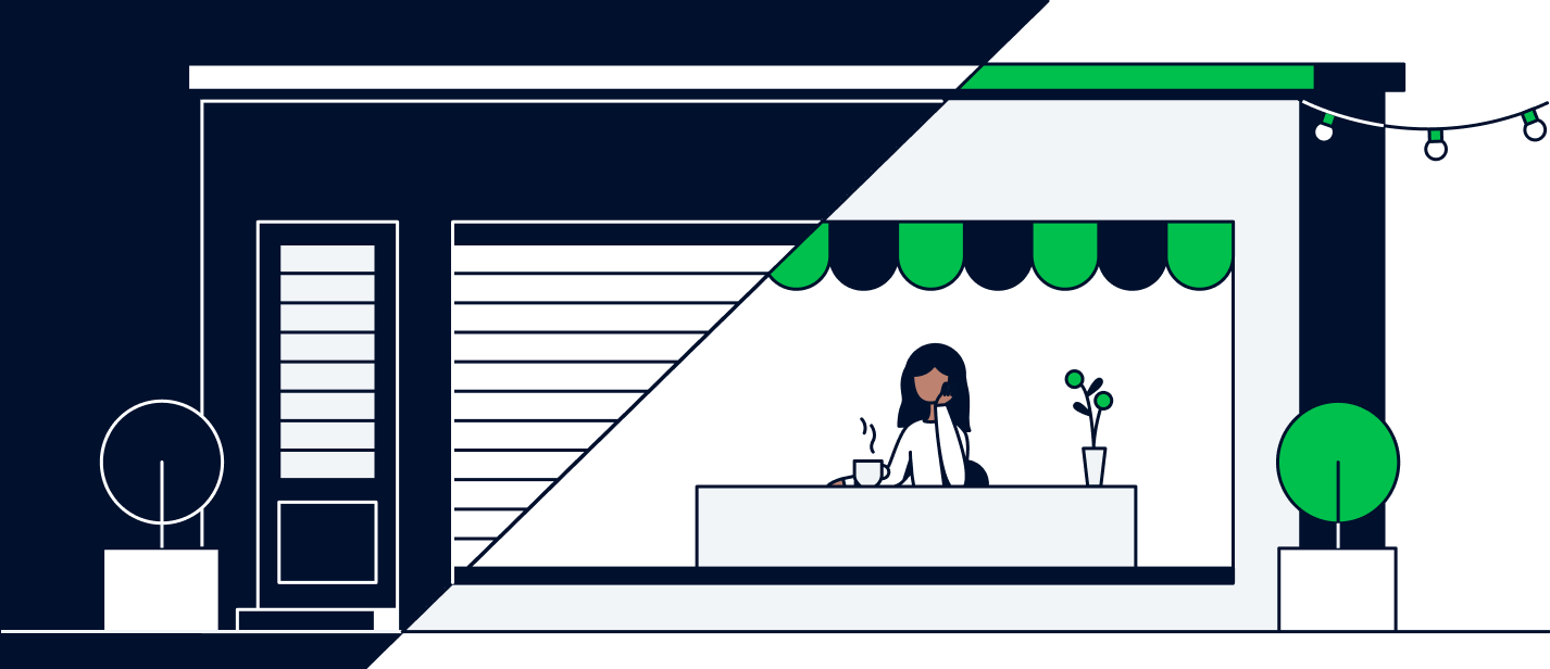
Indoor settings, like stores or homes, are clean but also have a warm atmosphere. We use simple lines and angles, adding small moments of personality without distracting from the main subject of the scene.
When showing the inside of a shop, hotel, or restaurant, we still keep the space simple and thoughtful. Choosing specific items to give the "feeling" of the type of the business, without crowding the space with too many people or things.
Animation
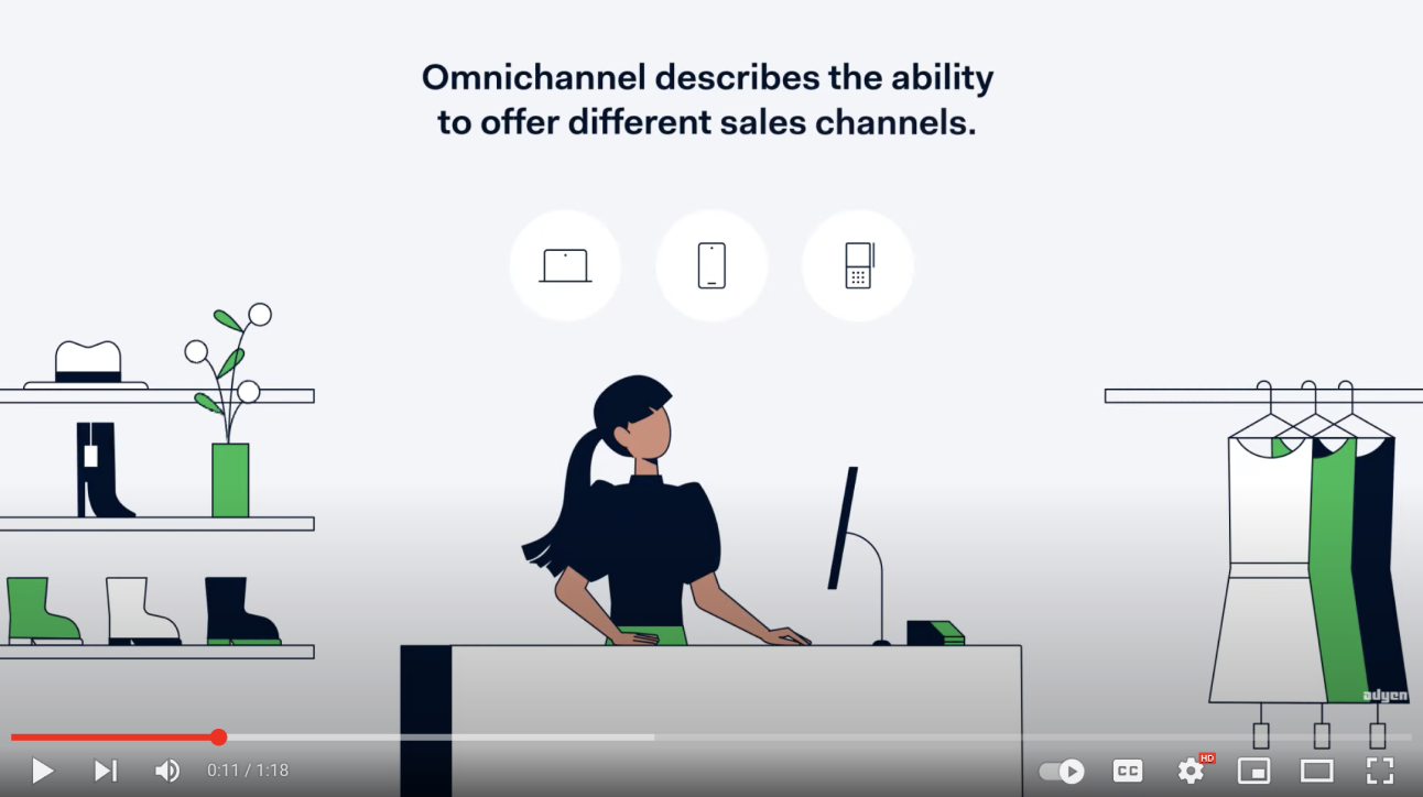
Our animations are used to explain (complex) concepts / products / features / ideas. They are informative and playful.
Usually we try to keep the video length to about 1 minute. The storyline always starts by presenting a problem on Adyen white background. Then a green text screen follows, mentioning Adyen and the specific solution. The story continues on green backgrounds, representing a positive result.
Our animations are guided by a voice-over, and custom-made music and sound effects. In terms of artwork, the previous illustration guidelines always apply.