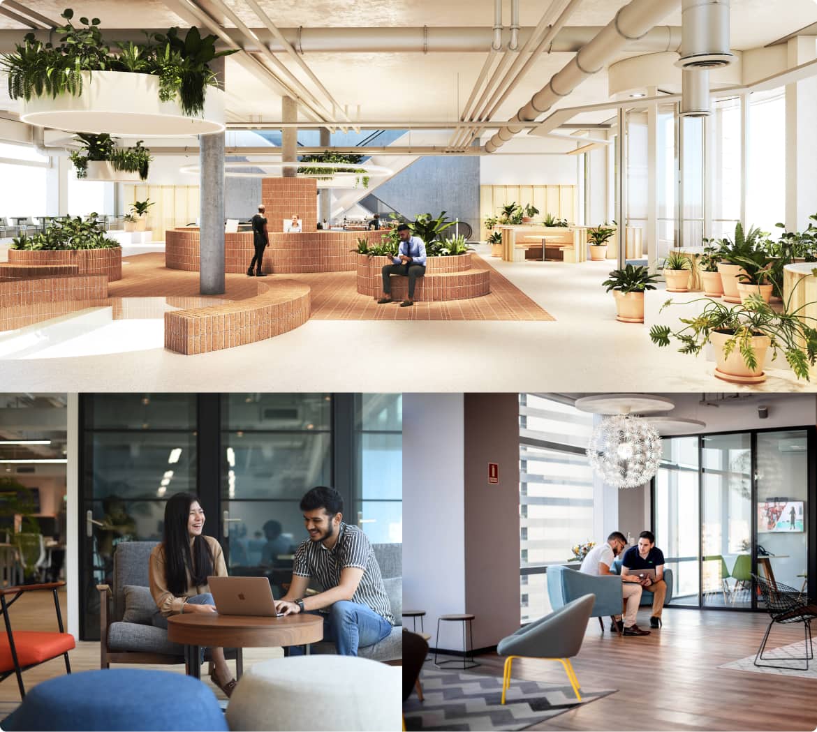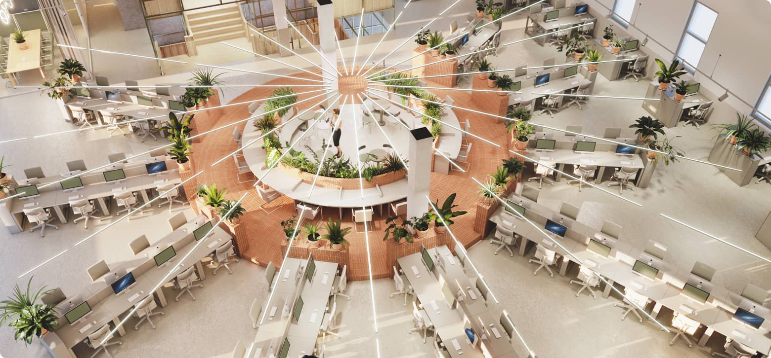
In order to apply the interior guidelines correctly and ensure a smooth process you should follow these key steps:
Process
Look & Feel
Words we use to describe the look & feel of the interior of Adyen.
Down to earth, transparent and honest
What you see is what you get. Why create complicated things if the beauty is already there. Let’s combine the practical with the aesthetics. If the design has no use other than decoration; let’s not use it.
Fresh, friendly, productive and positive
At Adyen we talk, not shout, to create a positive change. So do our interiors. We place the attention where it needs to be; with our people.
Connected
The office is a place to collaborate and inspire each other. We work together to get better. We stay connected. So does the interior. At Adyen we don’t believe in special treatment. We’re all equal.
Comfortable
Materials and quality craftsmanship create comfort.
Anything but corporate
Yes we are professional, we are able to deliver our best on time, we just don’t wear a suit while doing it. Let’s stay away from the classic corporate references.
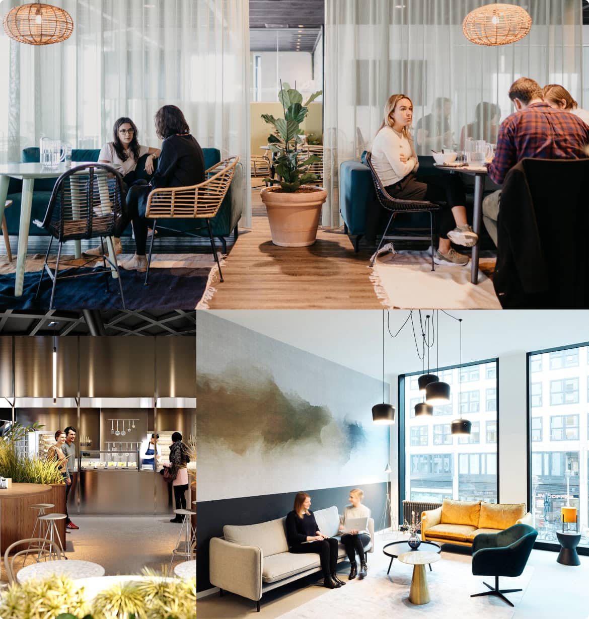
Layout
We believe that the layout plays a big role in creating a smooth workflow and enhancing
productivity. A great space creates opportunities for better communication and innovation.
If you are scouting for a new location: Our preference goes to open layouts with a lot of natural light. Preferably on the North or East side. Look for high ceilings, exposed architecture, and big staircases.
The three main areas
No matter how big or small the office, we always have 3 main areas.
1. Work area: where we focus, collaborate and meet.
2. Social area: where we arrive, receive guests, refresh, have informal meetings and socialize.
3. Support area: is everything we need to get by.
Interior colors
We use color to create a strong but calming environment for productive minds. We do this by keeping the following in mind:
- Use a limited color and material pallet.
- We go easy on the contrast between the colors and materials.
- Pick fresh, light and natural colors to keep the vibe fresh & positive.
- Go for the saturated warm soft tones and gradients to keep it friendly.
- Use the color of the materials to bring in color instead of paint.
- Avoid graphic images. Let’s limit the details and big color contrast.
It’s about the people, not the interior.
Primary colors

Tarpaulin grey
RAL: 7010
.jpg)
Silk grey
RAL: 7044
.jpg)
Grey white
RAL: 9002
.jpg)
Signal white
RAL: 9003
Accent colors
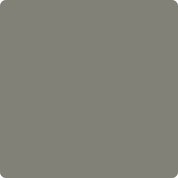
Concrete grey
RAL: 7023
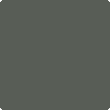
Tarpaulin grey
RAL: 7010
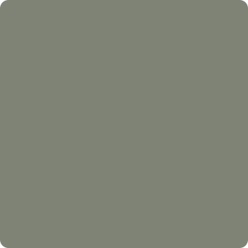
Cement grey
RAL: 7033
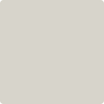
Grey white
RAL: 9002
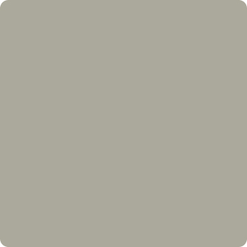
Pebble grey
RAL: 7032
Green
Our logo is green. Yes. Our interior has green plants. Yes. If green colors are used in the interior, they are saturated greenish colors inspired by a natural feel but that‘s as green as it gets. No need to leave splashes of green details to remind us where we are.

Keep up the good work.

Try again. Not there yet.
Visual branding
Visual Branding works like a name tag for the interior. It’s important for the visitors to recognize you for the first time. The interior should also be able to speak for itself. Since it’s based on the interior principles of Adyen, it undoubtedly looks and feels like Adyen.
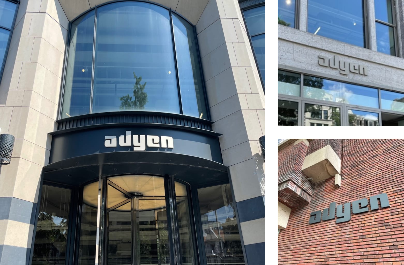
Logo
We use our logo in a specific way so we are consistent through all offices. Always check with Adyen Studio
team before putting any logo out there.
Exterior logo
Must be visible from the street. Use materials similar to the exterior of the building. Integrate into existing materials with enough color difference to read easily.
Interior logo
Our logo should be visible in the space when entering the office. We don't feel the need to show it everywhere. We know where we are.
Plant wall
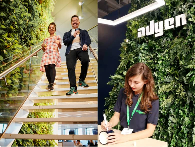
The logo will be shown on a plant wall with preferably real plants. It needs to look as natural as possible. Use a diversity of different plants so it creates a natural pattern and enough depth.
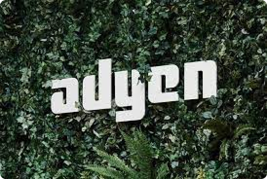
Keep up the good work.
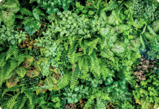
Do create a natural mix of plants.
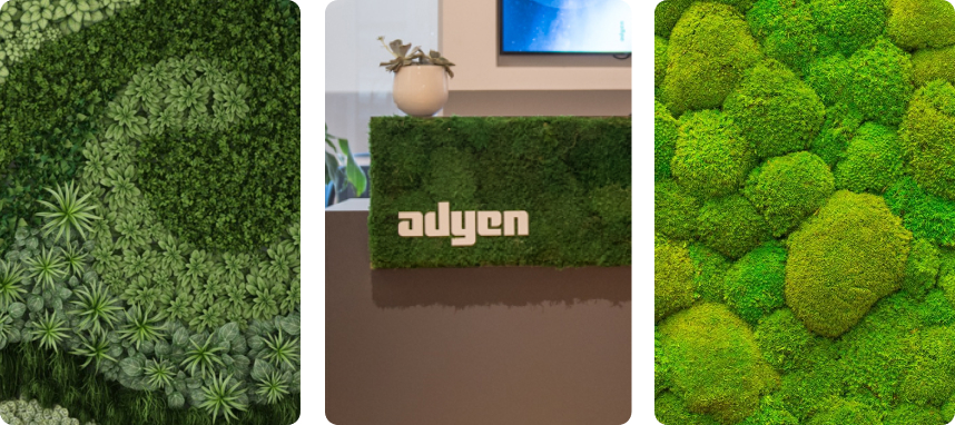
Don’t use patterns or one type of plant.
Dimensions
A logo should be large enough to be visible but not too big to draw too much attention. It should be proportionally in balance with the size of the wall or building.
Don't be tempted...
- To make the logo in 3D: Our logo is quite geometrical. When this is being made in 3D you cannot read it from any angle except the front. Try not to make it thicker then 5-10mm.
- To make the logo bigger than 130 cm wide: At Adyen we talk, not shout.
- To create an artwork out of our logo
- To use the Adyen 'a' on it's own
- To change the color
- To use patterns in our logo
- To make it from glossy or transparant materials

Try again. Not there yet.
Reach out to Adyen Studio team in order to create the right files for the supplier.
Details
Always ask yourself, would I want this in my home? For example: Would I want to sit in an office all day where everything is bright green? Would I want a fake green leather couch in my home? If you are ever in doubt our design team is at your disposal for ANY questions. Alternatively, please download one of the PDF's:
