Short and sweet
Less is more, especially when it comes to social media. Our messaging is simple and efficient, to easily catch the attention of our audience.
Imagery
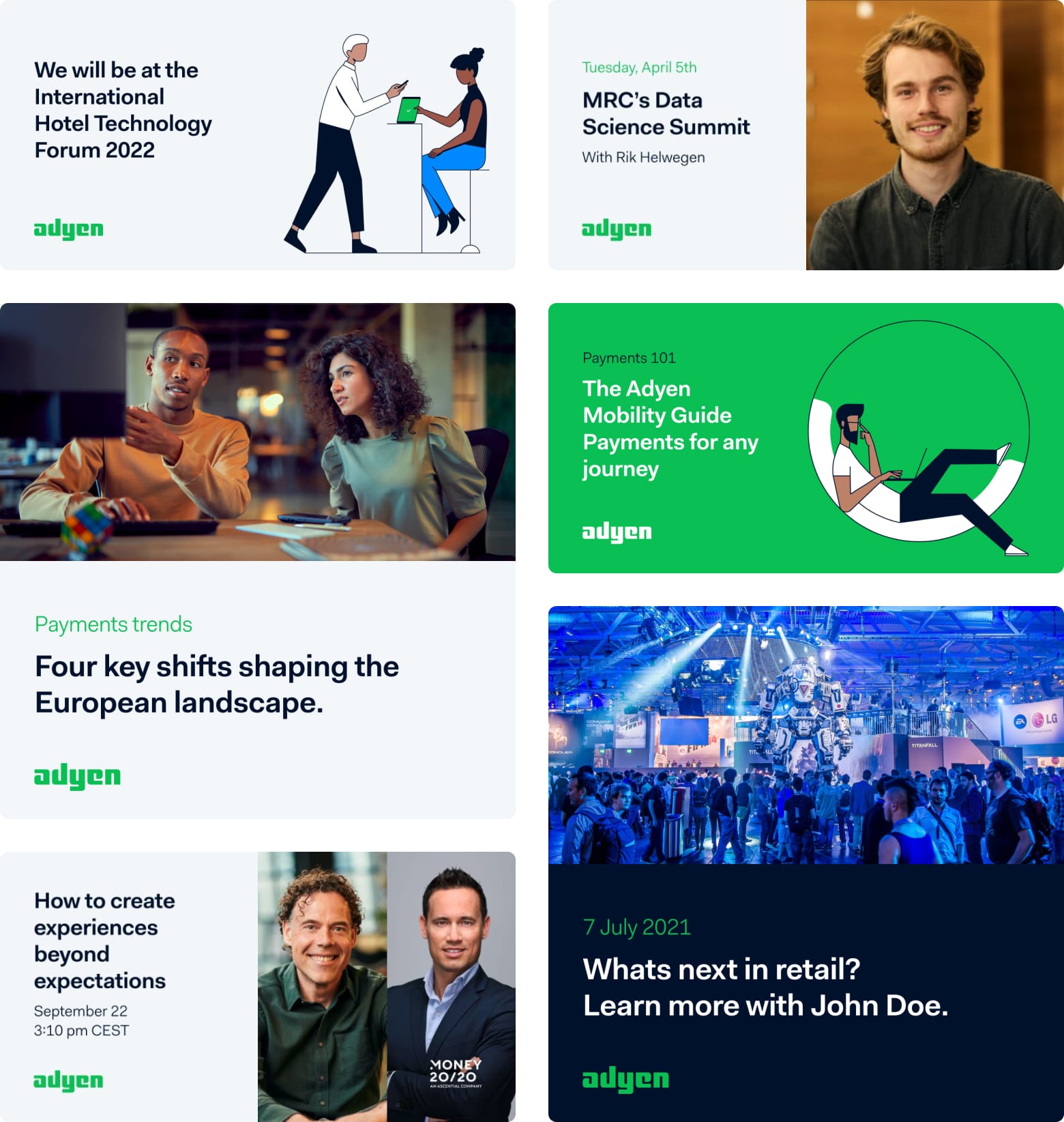
We make use of our strong photography library for a greater impact. Our illustrations help explain the abstract.
Co-branded
We have partnerships in many sides of the business. And we make use of these partnerships to strengthen the content we share online.
Our channels
LinkedIn
Our key channel. The most followed, most engaged with, the most pertinent. We use it to: run paid ads, share information about the company and its employees, the product, and the industry, besides local events, local stories, and highlight local execs.
Twitter
A place for brand awareness and media relations, where people go to share their views, no matter their industry or outlook. Twitter is meant for engaging with people, whether that be peers or other folks in the industry, it’s a chance to be a part of the conversation.
YouTube
Our home for video content. Vimeo is used for technical demos and internal videos. Main purpose of YouTube is archiving, but it should not be a dumping ground for any and every video. Also used for paid ads.
Facebook
Mainly used for paid ads.
Our formats
Formats for LinkedIn images are 1200 x 628 px for landscape and 1200 x 1200 px for square. Square works best for mobile, but landscape assets let you include a link to it.
Square format
1200x1200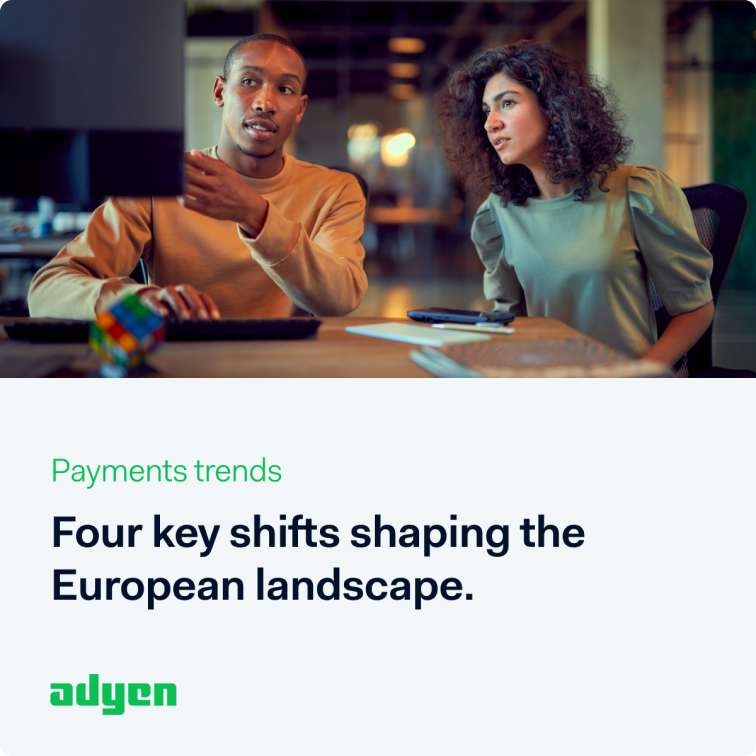
For carousels, videos, static and paid ads.
Landschape format
1200x628.jpg)
For videos, static and paid ads.
Pro tip:
When designing our social posts, make sure to visit our dedicated assets library. There you can find photography and illustrations to use in all social posts. They are available in both landscape and square formats.
In practice
Carrousels
Carousels are a great way to engage with our audience, offering up to 10 frames in one ad. It helps to build a longer story and provides the ability to showcase different products at once.
Less is more
It's easy to overload a carousel ad with too much copy, so the secret is: always keep it simple. Short copy will deliver a better message.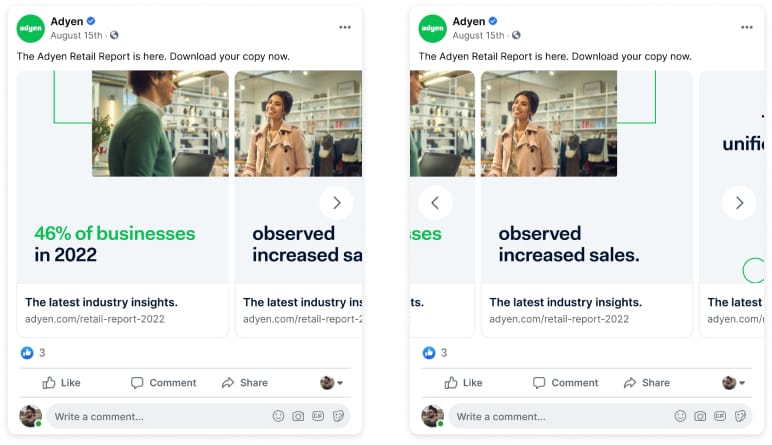
Customization
Carousels will always vary depending on the campaign. Always check with our Design team for guidance, we're here to help.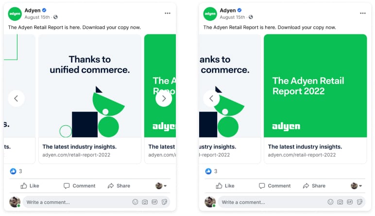
Do's & Dont's
.jpg)
Make use of our photography library
.jpg)
Refrain from using 'stocky' imagery
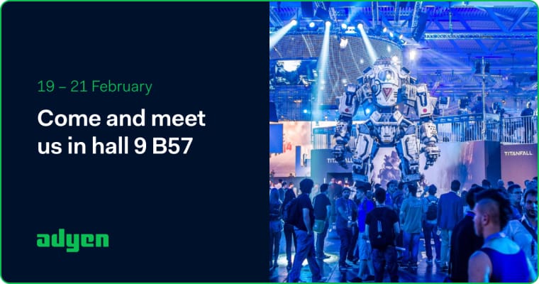
Stay simple with the number of text styles
.jpg)
Don't overuse text styles and colors
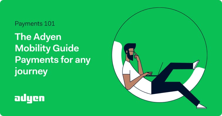
Illustrations should fill 50% of the visual.
.jpg)
Don't over scale illustrations.
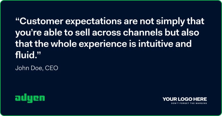
Keep quotes short as possible.
.jpg)
Don't make use of long quotes.