Before we dive in
We have a strong visual identity and every part of our communication must embody our unique approach. This toolkit aims to helps you to create inspiring and streamlined video content for us. Remember: this toolkit only serves to guide you. Make it your own!!
Main principles
Our video content should follow these principles
Authenticity
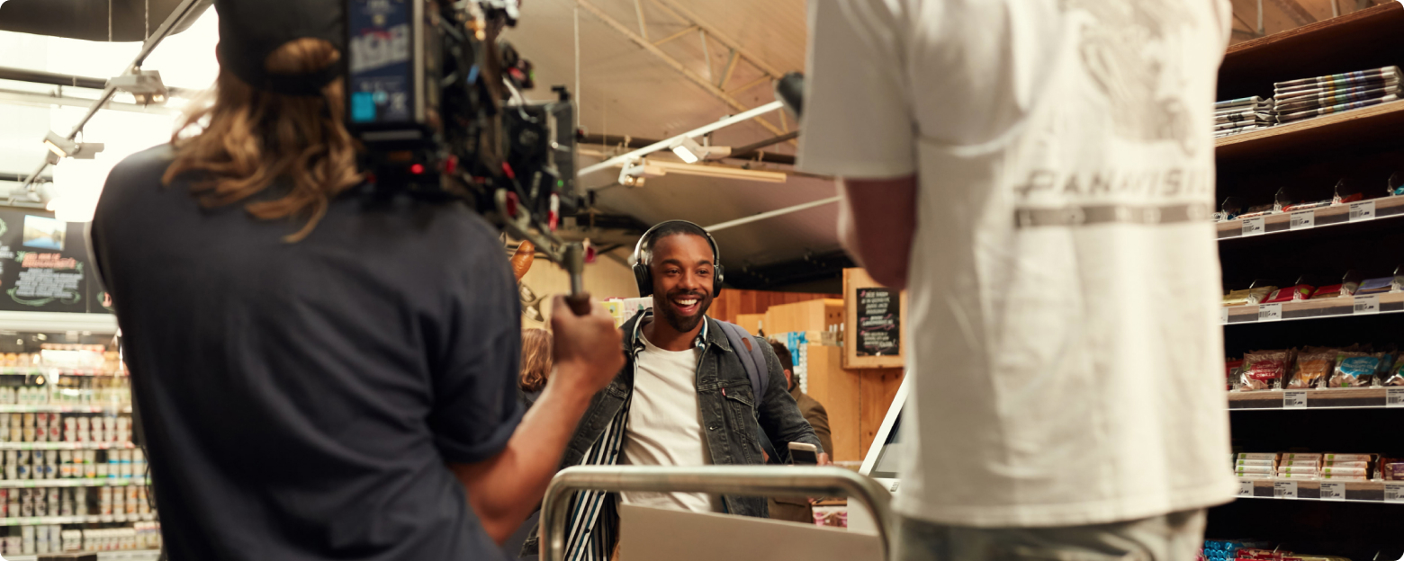
Real people and unique stories. Show reality instead of concealing imperfection. Always be sure to choose the oposite of stock(y) footage.
Aesthetics
We like fresh pictures and powerful, filmic shots.
Ensure that every step in the process is handled with care and expertise.
Human approach
People are our biggest asset. We believe in including all sorts of different people in our content. We’re all about personal, relatable and inspirational storytelling. Avoid jargon and technicalities.
Scalable
Video is a pricey way to tell a story. We always question if it’s the right medium to tell a particular story. Always ask where this video is going to be used and try not to make productions for one-time-use only.
Case Studies
Case studies are real-life examples of Adyen and merchant success. The persuasive power of these stories comes from their authenticity. Be clear on who the hero is and reflect the merchant’s brand personality. Use imagery to convey the problems we solved in the case study, subtly nodding to both challenges and resolution in different shots throughout the piece. Advanced story review, shot list planning, location, talent/hero (interviewee) selection, products/service, payments in action.
Hardware
Here’s some things we’d like to use shooting film.
Camera
We shoot on preferably Arri high-end cameras. We prefer the Arri Alexa (mini or LF). Sony or Red high-end cameras are also suitable.
Aspect ratio
We always use a 16:9 aspect ratio for filming. Never make use of letterboxing. In post-production we create different crops for social platforms.
Resolution
The minimal resolution to shoot in is HD 1920x1080 (1080p). We also accept 2K, 2,5K or 4K.
Frame rate
Our preferable frame rate is 25fps, but we also accept 30 fps.
Codec
When possible always shoot on the highest codec of your camera.
Lenses
We prefer prime lenses over zoom lenses. They give a better image quality and force you to make thoughtful choices on your compositions. We like the Leica Summicron en Summilux series, the Sigma FF highspeed series and Zeiss Supreme lenses.

Look and feel
Composition
Try not to cram too much into the shot, instead create simplified framing. We like to center our subjects and objects, and leave negative space to create a well- arranged balance. Avoid complex angles. Create depth by using a shallow depth of field and by positioning various elements in the foreground and background.
Keep in mind the rule of thirds, but don’t be afraid to experiment.
Camera movement
Use a natural camera language, combine subtle handheld camera work with tight symmetrical shots (tripod, dolly, steadicam). Be sure that handheld doesn’t mean messy. If in doubt: always choose a steady tripod shot.
Lighting
Aim for lighting that appears to be natural light. We only soft light spreading sources (with use of softboxes or chimeras) or available (natural) lighting sources (if they offer sufficient light). No hard direct keys lights that create strong highlights or shadows. Images should look naturally white balanced, and not overly exposed or stylized.
We like fresh and positive pictures, lighting should never be low-key or dark in any way that could create a negative suspenseful association.
Color
Our color pallet is vibrant and fresh, feels modern and future facing.
Keep in mind that post-production should not be the only part of the process where color counts. In composing your shots never stick to just one color, but make combinations that enhance the imagery. Choose wardrobe, props, and locations/sets that support the use of our color pallet and that draw attention to our subjects or main characters/products.
When grading video footage make sure to have a colder overall look, but create warm skin tones. Black is never a true black but an Adyen black.
Shot list
In your shot list make sure to include many shots and scenes with people. Try to capture people in spontaneous, real and relaxed moments. Make sure they feel at ease and act like they are in their natural habitat. Avoid “staged”, “stocky” set-ups.
Try to include a few shots in your shot list that include the hardware (i.e. terminals) but make sure they are not isolated, but shown in a user environment context (i.e. on a desk/counter).
Capture inspirational shots. Nobody likes to see just office space. Go outside and be creative.
Interview essentials
Sit down
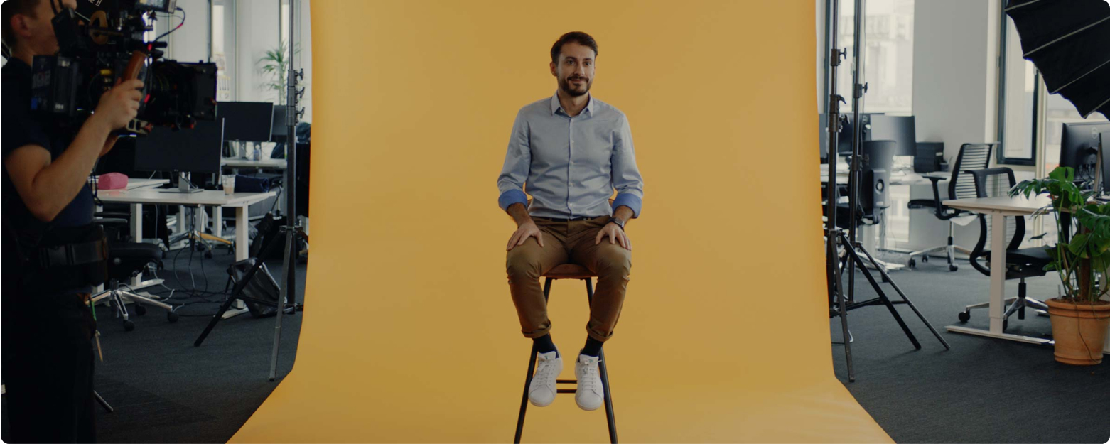
Let your subjects always sit down on a chair instead of standing. Take care that the backrest of the chair is not visible.
Background
Pick a relevant and pretty background (i.e. glass, a nice view, office space or some green). Find a space with little background noise.
Depth
Be sure to create a considerable distance between the subject and the background. Use a wide aperture of your lenses to create a shallow depth of field.
Eye direction
Make sure the interviewer is right next to the camera. Use an eye-line for the subject that is close to the lens.
Audio
Get optimal sound results by using both a lavalier microphone and a directional microphone for audio recording. Be sure to hide the lavalier microphone on the subject.
Two camera-angle setup
Make sure to shoot at least two different camera angles in a video interview. A wide or medium shot, and a close-up shot. If you have only one camera available: switch lenses and repeat your questions.

Post-production
Editing
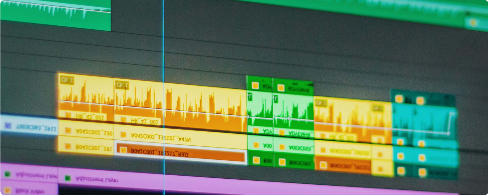
We love upbeat, rhythmic and quirky edits. Be sure to create tension and suspense throughout your edit. Tease your audience. This can be done for instance by using teasing quotes or shots at the start of the video, instead of starting at the usual beginning.
Make sure your content is short, sweet and to the point. As every editor knows: kill your darlings to make your edit better.
Sound and music
Music
We avoid overused commercial instruments and sounds (stocky/cliche - ukulele, handclaps, and whistles, etc.). Instead we prefer authentic and original sounds and music.
Sound design
Sound design will improve your edit - so make use of it, but don’t overdo it. We like to sync recorded sound, ambient sound, and subtle details. Stay away from digital Hollywood sound FX.
Composition
Arrange instruments step by step and in sync with the story. When sound is bonded with visual, it becomes easier to follow the story.
Voices and voice-over
Our stories always center people, so their voices need to be sound mixed in an audible and clear way.
Positive and easy mood
Music should support the Adyen brand. We like positive, friendly, lighthearted, creative and fun.
Rhythm and pace - a clear rhythm helps to provide forward momentum and tension. It also keeps your video smooth and energized.

Fonts
Our brand typeface is Fakt. We use different weights to communicate different parts of our identity principles. Blond feels functional for body copy, Normal feels straight talking and modern, while SemiBold feels bold and daring. SemiBold should be used sparingly — let’s not be too shouty.
Title cards
In editing your video, include a title card that contains the name and topic of your video. Use a clean and calm shot as background. It needs to be visible for at least 5 seconds.
Download our videokit with these title cards here

Title cardThematic video
For thematic videos, for example our “Unobvious Stories” employer branding series, we use a big a bold title over 2 lines. It's possible to create a highlight with contrasting blond and semibold typography.
Title cardThematic video
Like the first option it's also possible to put this frame on a white background if there's no b-roll available to function as background. Depending on the video series, the background can change within the range of our brand colors. If in doubt, consult the Adyen design team.


Title cardThematic video or series
A tertiary option is possible if a smaller subtitle is needed. The type is center aligned with a small subtitle, in this case highlighting it's part of a 3 part series.
Title cardCase studies
This title option is specifically for our case studies.


Name cardLeft aligned
For title cards we use this template. We use first and last name, followed by the function title "comma" company.
Name cardRight aligned
For this name card option goes the same as previously mentioned, but right-aligned. In a video production with mainly Adyen employees we prefer only first names being mentioned, like here in the employer branding video series "Unobvious stories".


Pre-endcardText with highlight on black
This endframe can be used as a closing statement or text is needed in the video, and highlight an import word or part of the text. This frame is followed by the endcard with Adyen logo.
Pre-endcardText with highlight on white
This endframe is a white variant of the previous endcard. This frame is followed by the endcard with Adyen logo.


Pre-endcardText with URL on black
This endframe can be used as a closing statement or text is needed in the video, with a small subtext and URL. In this case it was used to refer to the second part of the video series. This frame is followed by the endcard with Adyen logo.
EndcardAdyen logo on green
At the end of all our video content we show our main brand elements: our brand color (Adyen Green), the Adyen logo and our tagline 'engineered for ambition'. We do this by using a super that lasts for 5 seconds. It can be animated or revealed with a hard cut. We never (cross) fade this super.

Color correction & Adyen LUT
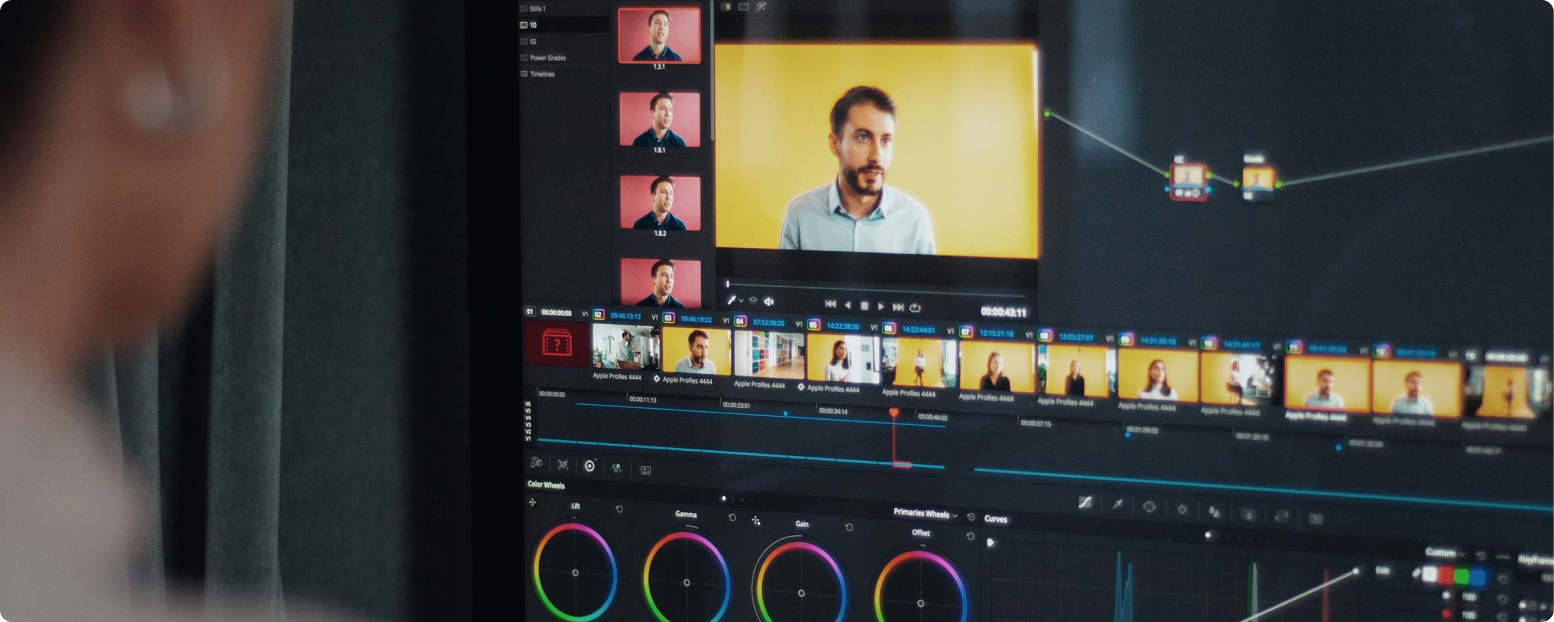
Even though the Adyen LUT is specifically designed to be used with the ARRI Alexa, there is a way to make the LUT work with any type of camera. For this process, we recommend using Davinci Resolve, the industry-standard in color grading. Depending on what software you are used to be working with you might find that Davinci Resolve works a little differently. Instead of making adjustments to an image by stacking layers, Davinci Resolve is designed upon the usage of nodes. A basic color grade consists of at least two nodes. The first node is used to make global adjustments to and image, such as exposure correction and white-balance. When the image is balanced you can use a second node to provide your footage with a LUT. In this case, this would be the Adyen LUT.
When your footage is shot using a different camera than the Arri Alexa you need to add a node prior to the Adyen LUT. To this node, you will haveto add a Color Space Transform. You will find this effect in the tab “OpenFX”. With Davinci’s build-in Color Space Transform you will be able to convert your camera’s original color space to match the footage of another camera, in this case, the ARRI Alexa. Set the input color space and the input gamma to match your original footage. Then set the output color space to ARRI Alexa, and the input gamma to ARRI LogC. You are now able to use the Adyen LUT in a third node. It is important to remember that the Adyen LUT should always be applied at the end of a grade. Any corrections on top of the LUT will alter the look that was carefully designed.
Subtitles
We never burn subtitles into our videos. Instead we need a .srt file for each video, containing the timecoded subtitles. This always needs to be part of the delivered assets.
Export settings
We will need at least two versions of each deliverable. One for web purposes, and one as high quality back-up.